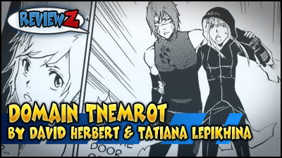
Domain Tnemrot
by David Herbert and Tatiana Lepikhina
Reviewed by Fes Works
Ok… so…
If you have not guessed by now, I have a sort of routine in reviewing these comics. Because these are webcomics, there is a lot more going into them than just the comic itself. It is the entire presentation, which includes the website.
The whole package.
So let’s begin again.
– – –
Back to the URL issues. Granted, the comic’s name is “Domain Tnemrot”, but “tnemrot” is… I had to double check to see if it was an error. It doesn’t really look like a word, let alone I have no idea how to pronounce it. Which is a huge issue, in regards to someone remembering a name or url, which is “tnemrot.com”.
(Fortunately, the website has a FAQ page explaining that it is pronounced “Nem-rot. The first T is silent.”).
I’m not saying it’s a bad name. I’m just saying it is a bad URL. Granted, yes, you do want your URL to reflect your comic, but you also want to make the URL memorable. Sometimes that is more difficult with less common and/or original words.
In cases like this, I would suggest getting a second, redirecting URL, that would be easier to remember. Such as a prominant character’s name. That or a couple of words, or a short phrase that describes the comic a little bit.
Well, that’s enough of the URL. Let’s look at the site itself.
Ok, so we have “Domain Tnemrot” in a basic type face with a description of it being a… an online manga… and we are being told to “read right to left”…
Uh… You already got a glimpse of my opinion on “western-eastern manga” last time… but I’ll hold my tounge on this point for now.
Ok, ok. So, below this basic text is a leaderboard ad. Already this website is not looking so great. Now I don’t have a big problem with minimalism, but its the juxtaposition of the text title with the big image ad right below it. Depending on what ad is up, could look like THAT is the title of the comic… and not an ad.
It doesn’t help that the comic’s name is a dark blue, against the dark background image. It kinda gets lost. Again, the design could work, if not for the large leaderboard ad image… which is bigger than the comic name, and its description, combined!
This should be absolutely be changed.
The background image is decent enough, though it should also be fixed, instead of scrolling away to white, in my opinion. Since the body of the website is a dark grey, the stark white is just to sharp.
The rest of the site feels like its a basic template with color changes. It’s not a pretty site, but still functional. I mean it is a little busy with all of the text in the side bars, but as far as a spartan design, I’ve seen even MORE minimal and LESS functional. I’d only really push for a better header/logo, and to “fix” the background image.
– – –
Hmmm. Maybe I should give grades to each review point? Maybe fully next time, but If I were to grade this website design, I’d maybe give it a “C”. Changing the Header and background would easily bring this up to a “B”.
– – –
Back to the comic… which is supposed to be a “manga”. This is where I have a bit of a problem. Now, I will admit that I don’t know everything about this comic… or why english speaking people do this… but unless this comic was made by eastern creatives or eastern speaking areas that ACTUALLY READ RIGHT TO LEFT… then this is not a manga.
This has nothing to do with the style of the art, or storytelling methods. This is all about flow of reading of your marketed audience.
If you are making a comic for an english audience… or, say, an audience that readers LEFT TO RIGHT… then you make the comic to read LEFT TO RIGHT.
There is honestly no good reason I can find why people insist on doing this. It disrupts the ability to expand your audience that gets annoyed or lost while reading the comic. Because people that have been raised to right left to right, will naturally be drawn to read left to right as they read.
It’s like making a color comic for color-blind people. (maybe)
If this was specifically being translated to or from a right-to-left culture, that would absolutely make more sense.
ANYWAY…
With that RANT out of the way, I’m not taking marks off the comic for it. I mean, if does TELL the reader at the top how to read it.
So I mainly read the first and last chapter of this comic. The first chapter establishes a sort of premise for the comic. You know Pokémon? Also, have you ever seen the movie Gamer? It kinda feels like a combination of those, thus far… kinda.
The comic opens with a fight scene, and there are a several fight scenes over the comic. With a webcomic schedule of M-W-F, the fights could feel drawn out because it is action that is happening. Very. Slowly. But if you are reading through the archive, it flows a lot better. Which is par for most story/chapter comics anyway.
I took a look at the comic’s Project Wonderful stats, and it looks like the site frequently gets people that do huge archive dives. Either as new readers, or also possibly as existing readers that come by every so oftern to read a large chunk in one sitting.
Anyway, the comic’s story isn’t oo bad, really. It feels, and looks, like an eastern manga/anime property (for all that I have or have not been exposed to). A comic just starting in the middle of something, and the reader has to learn how the world works through the story being told.
Actually… The comic is shaping up to feel a lot more some 70s movie about a future run by rich people and coorporations, exploiting the poor for entertainment.
I can’t help by think about Rollerball right now…
So the art! It’s a black and white comic with screentones. You know, it works. There is energy and decent art. Background can range from being detailed enough, to a white background.
It’s not “simple” art, but it works. It may not be super detailed, not in color, but all of the importan lines are there.
I’m trying not to be biased about the art, really. It’s just sorta… typical. I’m not really getting a sense of an individualized style in this. Mostly just getting a feeling of heavily eastern-influenced art design. All without feeling unique enough to comment about.
The art is good and it works, but it’s nothing terribly special? Interesting?
I know it sounds kinda mean to say the art is good, but not good enough, at the same time? Admit I may have a bias, so please decide for yourself. I am actually liking how the comic is rolling along by the start of chapter 3, and the latest chapter (chapter 20) is starting to look interesting as well. Clearly I will need to keep tabs on this comic to catch up on the story!
Hi there. Thanks for the review.
If you’re still curious about the name, spell it backwards. And I have considered changing the background but it’s hard to think of what it could be. May get on that. And I’ve never seen Gamer, but Pokemon was a little bit of an influence, as well as Digimon and Metabots. I grew up with those sorts of cartoons.
Glad you liked it enough to want to keep reading.
Like I said, the simplest “fix” for your BG to to set it to be “fixed” (meaning it stays in place as you scroll). Aside from that, something different for the header would probably go a long way as well, strictly talking about the overall website design/look.
Gamer is a very.. graphic movie about criminals being used as real life First Person Shooter fighters… played by kids, mostly. By the same guys that make Crank.