Ok, Before I get started with the first review, I want to preface that these coming reviews are part of a trial run review process. Please send no new submissions at this time. Depending on how things go, we might be looking at continuing and/or expanding these types of reviews. Might these be short podcasts in the future, or continue as articles?
– – –
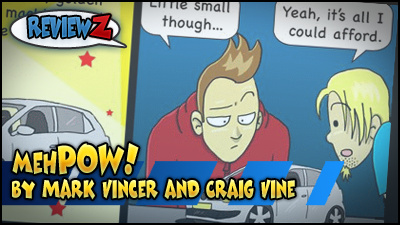
mehPOW!
by Mark Vincer and Craig Vine
Reviewed by Fes Works
The first thing that will catch your eye on this comic’s website is the header, which proclaims the comic’s name with a blasé “meh” followed by a “POW!” action, graphic affect. The comic’s two main characters sorta, impassively, presenting the logo. Which is fine because “impassively aggressive” is what this webcomic calls itself… and I’ll get to that.
The website itself is… a little spartan. It is a ComicPress WordPress site with minimal effort put in to change the design up. Completely black background; except for the distracting, bright white blog section. The complete lack of a “background center frame” for the content, creates so much “floating” dead space.
I mean, it’s still completely functional. With only 20, single strip comic updates at the time of this review, I was able to read through all of them. It was really easy to navigate without scrolling (a plus), with it being a strip comic and nav buttons right below the comic (also a plus).
Bottom line, the website isn’t really nice to look at. It could be much, much better. Then again, it could be a whole lot worse. At least there was some effort to make the website not look like the default template…. which is confusing, because this looks like a very new comic, but the ComicPress they are using looks outdated, or overly simplistic, compared to the newer (and better looking) included ComicPress templates I’ve seen out there.
… ANYWAY…
Perhaps it’s all “intentional”. Afterall, the comic boasts being “impassively aggressive”. So with that in mind, let’s take a look at the writing. Well, the comic is done by two people, but I don’t think they have listed anywhere on the website of which person writes or does the art. The “about” page mentions that the comic was born out of both of them telling jokes at a bar.
I’m going to have to believe that is true.
The comics are basically three-panel jokes. Jokes that a child may find funny, because they’ve not been around long enough to have heard the joke before. Low-hanging jokes that are similar to the sorta jokes and puns we think in our heads, but don’t ever say… unless we’ve been drinking, I guess. … ah.
I mean, the jokes will get a snort, or that quick exhaled half-chuckle. But thus far, nothing is terribly original. Then again… maybe that is the point? I can see that this comic is just something the two wanted to do to get there jokes out of their heads into comic form. To express themselves. That’s all fine and dandy, but unless they start hitting a new stride, I can’t see many people following this comic.
Still I will admit that there were a couple of strips that got more than a single chuckle out of me.
So let’s talk about the art. Again, I have no idea who does the art. One thing that… well there are a couple of things that bug me. First, the art in the logo is better than the art in the comic. This should never happen. The same care that went into the logo, should be seen in the comic strips, from update to update. So right now the art feels very inconsistent. Maybe it was drawn later, and they are stilling the process of honing their artistic talents.
Second, a lot of the art uses all of those mistakes that many webcartoonist do in their early years. I’m talking about re-using panels and art as a shortcut, and dead-on side-shots of characters. These shortcuts never help in the improvement of one’s artistic abilities.
Well, there are only 20 strips right now, so if these two stick with it, they should be getting better. They just need to stop taking artistic shortcuts, and hone their writing skills a bit better.
– – –
Maybe i’m a little jaded. Maybe senile. Am I too harsh with saying this comic isn’t funny to me? What about the comics to come? I know I wasn’t too bad about reviewing this one, as I know I kinda made things like I was going to be brutal. Really I just want to be honest as possible without being an asshole. So, with one down, wait until next week for my next review; picked from the pile of submissions I’ve got for this trial run.
Oh, by the way, submissions are closed right now. We’ll see how this month goes, before I look at opening submissions again.
Hi Fez,
As the writer/illustrator of the comic in question, I thought I’d be the first to reply. (Yes, that’s right, I am the writer and illustrator, Craig helps with the web stuff, ideas and fixing punchlines when I’m stuck. It’s more my baby than his)
I understand what you mean about the barebones look of the site and I agree. I gave myself a deadline to get something up with the intention of improving along the way. Haven’t got there yet. We have some great ideas for the site that I’m sketching out. Going to redo the template all together while hopefully keeping the navigation simple.
The jokes, well, they’re a little simplistic but I’ve only been doing this just over a month and I’m still hitting my stride. My Facebook page is growing steadily so I guess there is a market for it but I’m still learning.
I just want to say thanks for this because it’s given me a lot to ponder. I only have an hour or two spare to work on this so sometimes it is a little rushed. Maybe I should sleep less 🙂
Perhaps you should do a “webcomic revisited” thing, go back a month later, see if they’ve improved?
Asking my friends what they think is not always constructive. Thanks for the honesty and hopefully in the future we can make you a fan.
Thanks,
Mark Vincer
The most important thing to keep in mind is that this is a very young webcomic. Other reviews will have webcomics with varying ages. Really… unless you are not trying at all (or frequently go on hiatus)… there is only improvement going forward.
Thanks, it does mean a lot to us to get this kind of feedback. We are moving onward and upward! I am going to scale it back probably to two strips a week so that I can focus on quality (and spend time with the wife)
Thanks again, look forward to next review.