Darcy (Codename: Hunter), Mike (Prepare to Die), David (Zampano), Lem (Blank It), and Ben (Hero Academy) joins Fes and Mark to discuss B&W vs Color webcomics. This is a final revisit to the debate of which is better: black and white, or color. You’ll find out there is no real winner, but oh we love to fight about it!
[display_podcast]
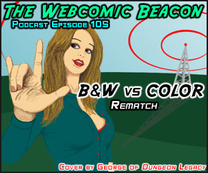
Cover Art by: George (Dungeon Legacy). Milestones: Aptitude Test (4yr)
Thanks to Witchiebunny, our announcer! Show notes: Dead Days, Sinfest, WAGON Webcomic Battle, PSI, Webcomic Beacon Facebook Fan Page, Visibone Color Guides,
Guest (Website)
Podcast: Play in new window | Download
[…] In anderen News. Die Webcomic Beacon Episode mit yours truly ist nun online und kann hier heruntergeladen werden: Webcomic Beacon Episode 105. […]
[…] newer webcomics, Loldwell and My Milk Toof, in their latest Horizons Watch podcast. And the latest Webcomic Beacon podcast features a B&W-vs.-color […]
If you want to see great color in the service of great storytelling, look at Stanley Kubrick films.
I once had to do a color map of “The Shining” in art school and you’ll notice how characters would stay in the same general color palette.
At the end of that movie, the colors were much more toned down. The father and son were equals. If the son found a gun, you know who he’d use it on.
Hi Webcomics Beacon! This is John Rios and I do the webcomic DEAD DAYS.
Now, this being the second time your (awesome) podcast has mercilessly bashed my strip because it doesn’t happen to be in color, I felt like I needed to comment.
DEAD DAYS began as a strip in my college newspaper that obviously did not have the budget to print in color. It was considered a treat if we were able to do one spot color throughout the issue! “We get to print RED this issue? SWEET! What’s the occasion?” Thus, I had to do my strip in black & white… and that was just fine with me.
See, like many of us, I grew up reading strips by my heroes like Gary Larson and Berkely Breathed in the newspaper and in compilation books. There wasn’t any color in those strips and frankly, I didn’t much care for the Sunday editions when they were forced to colorize them (I say forced, because I can pretty much assure you that the artist was perfectly happy working in ink). Sure, the black and white came from the limitations of the medium, but it also created a great feel to the artwork that I can only describe today as timeless. Just because I didn’t see any color didn’t make Bloom County any less funny.
When I graduated college and continued DEAD DAYS as a webcomic, I felt absolutely no need to go color. What for? The strip worked just fine in gray. Furthermore, I LIKED working in gray! For the same reason people still make black & white films, I do my comic in grayscale. I like the look and feel. It has that old school newspaper vibe. It makes you use your imagination. It’s (and I say this with no ego) timeless.
My point is that just because you CAN add color doesn’t mean you HAVE TO add color. If people’s internet and technology ravaged minds have trouble processing anything that isn’t coated in bright reds, blues, yellows and that “shine” effect the web 2.0 crowd seem to love so much, then I don’t know what to tell ya.
I love working in black & white. I love the look and feel of my strip. I enjoy the challenge of conveying color without using color. It’s a limitation I put on myself. Why? Because it’s my STYLE. I hope that people who read and enjoy DEAD DAYS and other wonderful black & white and grayscale strips out there appreciate the work that goes into creating a world that can be just as vibrant and interesting as anything saturated in technicolor.
Oh, and when the SWEET ASS color palette you use in your strip looks dated in 10 or 20 years, don’t worry, I’m not one to say I told you so. 😉
Oh… I just got your e-mail. Didn’t see you also posted here. 😛 Valid viewpoint and practice, of course! Of course it’s one of those subjects that everyone can’t agree on 😉
I may pick on Dead Days, but I’m sure it’s one of the most plugged comics from here 😛 😉
No problem Fes, it’s a great topic to debate. And don’t think I don’t appreciate the plugs!
And thanks Tanya for the support (when you’re around!) 🙂
*laughs* Yeah, had I known they were going to bash Dead Days again I would have shown up just long enough to defend you. It’s still one of my favorite strips – even though you seem to have lapsed into my update schedule… *grins*
I agree that Dead Days would be better in color, the B&W just doesn’t feel right. But the good thing is that those pages wouldn’t be too hard to get a colorist to finish off in the future. It’s a cool comic but might be cooler in color.